"It Has To Feel Right, Not Just Look Right"
Kayla Cerrone: The Vegan Illustrator Who Paints Music in Reverse
When I first opened Kayla Cerrone's portfolio, it quickly became clear that I would not be spending just one evening with it. So get ready. Her illustrations will do something to you. You think you are only having a quick look. And then you already find yourself wondering how a painted rock can look so alive. Let me share a little secret with you right here. It has to do with Kayla's very own technique.
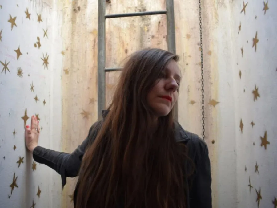
Kayla is an illustrator. She lives in the Twente region of the Netherlands. She graduated in 2022, went vegan shortly after, and made a decision that most people are warned against at the start of a creative career. Instead of working across as many fields as possible, she illustrates exclusively for bands and musicians. For her first two years, she simply studied nature, her materials and her own working process.
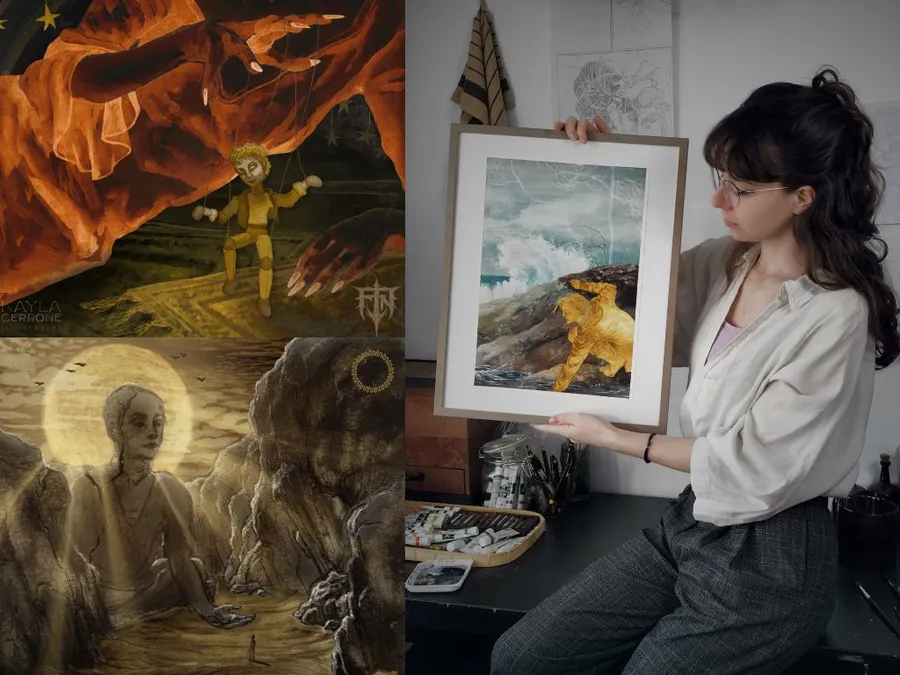
What came out of it is a body of work with a rough, atmospheric edge. Album covers for post-rock and metal releases, painted by hand and fully vegan. Here is what makes it special. This remarkable artist paints in negative, lights as darks and darks as lights, so the textures end up exactly where your eye does not expect them. Earlier this year, one of her paintings hung at Rijksmuseum Twenthe, right next to two of Rembrandt's portraits. I had the chance to get to know her and to ask her some questions. Please enjoy my interview!

Anne: Hi, Kayla! How are you doing today? How's your day been so far? Thanks for taking the time for this chat! I'm excited to get to know you and your art better!
Kayla: I'm also very excited and curious about your questions!
Anne: You started your introduction email with the story of your final year at art school, when you set yourself the challenge of illustrating everything a fictional band could need, from album art to merch, as one cohesive world. Something clicked. Can you take us back to that moment? What did that project actually look like, and do you still have it somewhere?
Kayla: While I was still searching for my own art style, I started experimenting with video and animation. At that time, I found it easier to create an atmosphere and narrative with the help of change across time. I enjoyed filming self-made sculptures, but I started to miss painting. I chose to get back into it, making collages of painted elements. I added music to support it, and that turned into the idea to create something in support of music instead.
I never did end up making one cohesive collection for a fictional band. Instead, I was drawn into doing a few different experiments. One of these experiments was Sol, an animation of a red sun floating in a lake. That one is still online on my Instagram. I also did my first real commission as part of those experiments, an animated face with moving hands, eyes and other parts of the face. I think shortly after I did that one, I realised that this was something that was really worth exploring more.
Anne: Like us editors and copywriters, some illustrators try to work across as many industries as possible. Especially in the beginning. You made the opposite choice, deciding to illustrate exclusively for bands and musicians. How certain were you, in those early months, that this was the right direction? And was there ever a moment when you doubted it?
Kayla: I've been lucky enough during my art career to never have a doubt about what it was that I wanted most. The whole path has always felt kind of meant to be. So the only thing to doubt was whether I could do it—something you can't avoid if you work in a creative field, especially when freelancing. The way I saw it, I had two options. And an important choice to make: I could either go for a wide approach, try to reach as many people as possible and fill my schedule with anything that came by on my path, or I could try to reach my full potential in a more narrowly aimed, specialised way. I chose the latter and spent the first 2 years after my graduation just working on my craft. Studying nature, materials, my own work process and the music industry. Not knowing whether it would pay off was certainly stressful, but I'm very thankful I chose this path. To get this excited about work every day, even on its own, makes it worth it.
Anne: On your website, you write that "it has to feel right, not just look right." I find that distinction really important and also quite hard to explain. Can you give me a concrete example of a piece where something looked finished but didn't feel right yet, and what you had to change?
Kayla: A good example is my illustration for the self-titled album by Doodbidder. At first, this illustration was a lot more grey, lower in contrast, and generally less dramatic. It was maybe more typical for the genre. But I felt it wasn't quite right as it was, and even though we agreed the illustration should be very dark, I decided to add in a brighter second option. I felt the added blue and brown, as well as the more dramatic contrast, in a way made the illustration feel darker, with a stronger presence of the Doodbidder figure. The band agreed, so that ended up being the final illustration.
Anne: The negative painting technique genuinely stopped me in my tracks when I read your description. You paint the whole illustration in reverse, lights as darks and darks as lights, and then flip it digitally, so the textures end up in places the eye doesn't expect. Where did this idea come from? And what is it like to spend hours on something you can't fully see until the very end?
"Textures end up in places the eye doesn't expect"

Kayla: This started years ago when I was still using a cheap photoscanner. The way it scanned was quite unappealing—it had harsh lighting and picked up too much texture from the paper. To get the colours back to a nice brightness was not easy because of the high contrast within a block that should be a solid colour. I found flipping it into negative gave the illusion of less muddiness and more brightness. Since then, I've found a lot of value in it, and even with my good photoscans now, I still choose to paint a lot of things in negative.
The main appeal is, like you said, that textures end up in places the eye doesn't expect. Normally, when you paint a rock, you paint the shadows. The texture is exactly where we expect it to be, and we recognise instantly 'that's a sheet of paper'. That unavoidable feeling can pull you out of the scene and make it look flat. When I paint in negative, that texture is not in the shadows but in the lights. It seems like a small difference, and it is—I do want that texture, and I do want you to know it's paint on paper. But that texture ending up in unusual places means we read the scene slightly differently. It's a subtle, subconscious thing. I believe for my work, that it makes the atmosphere more enveloping.
Working on something for a long time without being able to really see it is both more and less stressful. It requires a lot of concentration; I can't work intuitively, but I have to really keep track of where I'm at, creating a mental image instead of looking at the thing in front of me too much. But it also stops me from getting lost in details, which can sometimes muddy up a painting. The slight unpredictability adds some character and ends up being more interesting than a polished, perfectly predictable version. When painting in negative, I can more easily put down a confident stroke and leave it there.
Anne: You mentioned keeping notes and making marks directly on your paint tubes, so you can use each pigment's behaviour intentionally. That is such a specific and almost scientific kind of care. Can you tell me about one paint or pigment whose behaviour genuinely surprised you, one that taught you something you hadn't expected?
Kayla: One of my favourite pigments is phtalo blue (or green). Normally, when you thin out a colour, it goes from a more saturated version to a lighter, less saturated version. Phtalo keeps a strong saturation even when thinned out a lot, and on top of that, it has an extra dimension: when used thickly, it can be not just very saturated but also very dark. It's a pigment that creates a mess when used in the wrong way, but beautiful contrast and gradation when used correctly. I also like to use yellow iron oxide in combination with other pigments. It's a floating pigment, so when you use a lot of water, it ends up on top of the other pigments, creating an interesting layering of colours.
Anne: "I make good use of my nearby forest." That line from your website has stayed with me. You go there to study textures and shapes, but also to do your concept work because, as you put it, "the sound of the wind going through the trees creates a great place to focus." Do you go there with a specific question or problem already in mind, or do you let the forest decide what you need that day?
"The forest gives me a clear and open mind"

Kayla: When I start on a new commission, after I've fully understood what the release is about, the next step is to determine what exactly should be communicated visually for that release, and how to best approach that. That's when I go into the forest, where the environment is more neutral. My desk, for example, always holds some associations of the last project I worked on. The forest gives me a clear and open mind for where the current project could be taken.
Anne: You've been vegan since shortly after graduating in 2022. You wrote that you knew about paintbrushes, but that paper and pigments were a surprise. Can you walk me through that discovery process? How do you research and verify whether an art material is actually vegan, and are there materials that are still challenging to source cruelty-free?
Kayla: There is a list on the Bromleys Art Supplies website that was a very helpful start. But not everything is on there, and my material needs have gotten very specific. First, I always just google a new material, and if I'm not sure, I contact manufacturers. Unfortunately, the replies are not always helpful. In those cases, I look for an alternative. The main challenge is paper. It's not easy to find information because there are so many varieties, and the sources are more complicated than, for example, those of pigments. Thankfully, there is a lot of beautiful vegan paper out there that I can rely on.
Anne: You decided to continue using the non-vegan materials you already owned when you went vegan, until they genuinely run out, but for any new purchase, there are no exceptions. That is a thoughtful, sustainable and honest position. Looking back now, a few years in, how do you feel about that approach?
Kayla: I think that was the right decision. I've started taking extra good care of my animal hair paintbrushes, hoping to prolong their lives as much as possible. There are great vegan replacements, though, so when they do end up being unusable, I might not even miss them.
Anne: Your portfolio moves across very different emotional atmospheres. Bitterlight's "If Life Doesn't Kill You, Emptiness Will" sits in an entirely different world than the bright, almost luminous colours of the Sparkle Glitch single "Artemis in October." How do you prepare yourself emotionally when you start work on a new project? Do you listen to the music on repeat, or do you prefer to approach it from a more conceptual distance?
"What needs representation, and what needs to exist only in its own space"

Kayla: Something I love about working with musicians is that their writing process can be really varied, and I try to tune in to that. Some albums are written primarily from an auditory perspective, with concepts or lyrics coming second or even being left out entirely. Other albums come from a concept first, and are built up in layers on top of that. I find it fascinating to hear about, and it's a lot of fun to work with. Of course, I always listen to a lot of the music of the release I'm working on, but also of past releases, to see how they relate. Apart from that, my focus is always different.
Sometimes you can find song- or album titles represented in some way in my work, other times I visualise something that wasn't put into words yet. I try to stay aware of what needs representation, and what needs to exist only in its own space.
Anne: Earlier this year, the Rijksmuseum Twenthe showed one of your paintings as part of "Twentse Gezichten - In het voetspoor van Rembrandt", a portrait project in response to two small, intimate Rembrandt portraits. Nearly 300 artists submitted work, and only 30 were selected. The portrait genre is so different from the atmospheric narratives you create for bands. What drew you to the project, and what was it like to make a portrait in that very specific context?
Kayla: I chose to participate because for me it was right in that sweet spot, just outside of the comfort zone. For my autonomous work, I'm often training something specific, and for commissions, I have to stay within the boundaries of the music release. Choosing my own narrative and working on something that should work independently was a fun challenge. I was surprised to hear I was selected, especially because I thought I went a bit off brief with my questionable 'portrait'. It was quite a special experience to have my work hang next to that of Rembrandt, so I'm very glad I applied despite my doubts!
"Ask, literally, for professionalism"

Anne: It's 2026, and the world of rock and metal can still be a space where Women, Trans, and Non-Binary people have to work twice as hard to be taken seriously. As musicians and as creatives. You are also working right in the middle of that. What does that feel like from where you are standing, and has your experience as a vegan, as an activist and as a woman shaped the projects you choose to say yes to? What do you think would be the best strategy? Ignoring the typical cis men's attitude and structures? Always keeping your armour up, ready to fight? Anything in between? Any micro feminisms that work for you?
Kayla: In the music industry, it can be difficult to tell the difference between a lack of respect and innocent unprofessionalism. And in the case of a lack of respect, it can be difficult to tell what the cause of that is. I choose to keep it simple and ask, literally, for professionalism when I'm uncomfortable with the way someone is behaving.
Anne: If there was one thing in the world you could change, what would it be and why?
"I wish using the internet were more difficult"
Kayla: I wish it were more difficult to use the internet. I think it's great that we can connect with things outside of our direct surroundings and social bubble, but the way the internet is currently set up does much more damage than good. I think if it were very difficult to navigate, we would only bother to seek out things that are actually valuable to us.
Anne: What is coming up next for you? Are there any projects, releases, or plans you can already talk about?
Kayla: I can't mention specific releases, but what I can say is that I'm working on two exciting projects with a slightly different format from usual. They forced me to think a bit bigger, and to plan ahead in detail right from the start. I hope to do more like it, so I can't wait for their release!
Anne: Thank you so much for taking the time to do this. I really loved getting to know you a little better, and I hope our readers feel the same way. All the best for everything that is coming, and let's definitely stay in touch!
Kayla: Thank you very much! I really enjoyed doing this and loved your thoughtful questions. We'll stay connected!